As you probably know, Second Canvas is a platform focused on helping museums to build multimedia experiences by combining super high-resolution images with interactive storytelling.
The platform includes the ability to embed and share those enriched images in an app, website or a digital publication, the possibility of building solutions for digital labeling and in-gallery interpretation devices, or the option of making your collection reachable for audiences anywhere in the world through digital exhibitions.
What do these digital exhibitions offer? This solution provides cities and museums of any size with an easy and intuitive way to build exhibitions with digital versions of works of art.
Here is an overview of “A digital experience: 7 Works, 7 Museums” a pilot held at the Laboratory of San Telmo Museum of Donostia/San Sebastian (Spain), in February 2017, which will provide you with a better understanding of what Second Canvas Exhibitions are.
This pilot project consisted of an exhibition composed of digital versions (in super high-resolution) of works of art from various museums and collections. Right from the start, our aim was clearly to create a unique experience with the digital version of the works, one that offered visitors an experience which surpassed the mere contemplation of the work on a screen. To achieve that aim, we considered three conditions were a requisite:
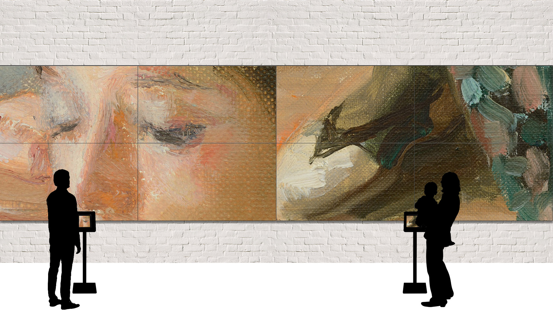
- We wanted the works to be projected on large format screens to create the most immersive experience possible.
- The digital versions should be very high resolution with the option to explore details on demand, creating a feeling of discovery and enhancing visitors’ interaction with the work.
- The images should be enriched with additional content to help visitors interpret the work.
The Display

Two possibilities were considered to present the works to the visitor: TV screens or projectors.
TV screens a priori presented fewer problems with lightning, and their installation in the space was less complex, although projectors might make it simpler to obtain larger image sizes. Finally, LG Electronics’ participation as a contributor (providing the material) was the factor that tipped the balance in favor of using TV screens.
Although initially we requested 85″ screens or video walls for all the works, availability issues on the necessary dates meant working with 55″ LED screens and a video wall comprised of 4 55″ screens.
The Interaction

Various options were considered:
- Touch Screen
- Gesture-controlled interface: Leap, Kinect, and so on
- Connected Devices:
- Second screens (mobile devices)
- Apple TV / PlayStation
- Mouse
In the end, we decided to use some type of connected mobile device (Smartphone, Tablet) because it involved a low technological effort (an adaptation of the Second Canvas app for this use could be made in a reasonable amount of time) and offered users a familiar type of interaction (low learning curve).
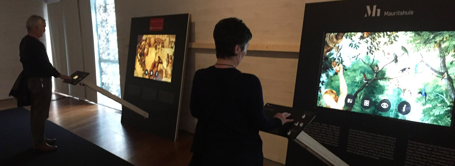
And the specific device chosen for this purpose was an iPod, connected to the screen where the work was projected via an HDMI cable. The iPod was docked in a lectern 1 meter away from the screen, thus providing the proper perspective to navigate through the work.
There were several reasons for choosing an iPod:
- A very reasonable price.
- A screen ratio of 16:9, which ensured that the image display was the same on both devices (iPod and TV).
- The same technology as iPhone and iPad (iOS), which facilitated the reuse of existing software.
But this choice also had negative aspects such as:
- Medium resolution (“no retina”), which in the most extreme cases (maximum zoom on the video wall) compromised quality a bit.
- Small screen size.
The software
A version of the Second Canvas app adapted for this purpose was installed in the devices. Each device contained a single work, so that each display had a single piece, reinforcing the analogy with a “traditional” exhibit (to facilitate users’ initial approach to a disruptive experience).
The solution was designed for offline use, eliminating potential problems related to Internet connection.
User interactions were stored in the device and extracted at the end of the experience.
Interface
To facilitate correspondence between tactile interactions on the iPod with the result on the screen, a system was used that replicated the position of the fingers on the iPod on the TV screen. Text sizes were also optimized, and a “back to top” option was included.
The app was available in three languages (Spanish, Basque and English). The input screen made it mandatory to select a language, which in turn facilitated understanding of how to interact with the work.
Then the app placed the work in the centre of the screen and showed the basic navigation buttons: home, general information, storytelling, and additional layers (IR vision, X-ray).
Existing audio content was removed to simplify the installation. Audio options will be explored in the future when there is more time and a larger budget.
Contents
The connecting thread of the experience was the “digital” concept. The availability of content suitable to the format and timelines required was a key criterion to enable participation in the pilot.
Another key was that the works be relatively inaccessible to the target audience (due to location or other reasons).
Museography
A simple, functional and economic exhibit was designed that would comply with the aim of the pilot project: to test the feasibility of and interest in this type of proposal. In designing the space and furnishings a number of factors were taken into account:
- The exhibition would show only digital work.
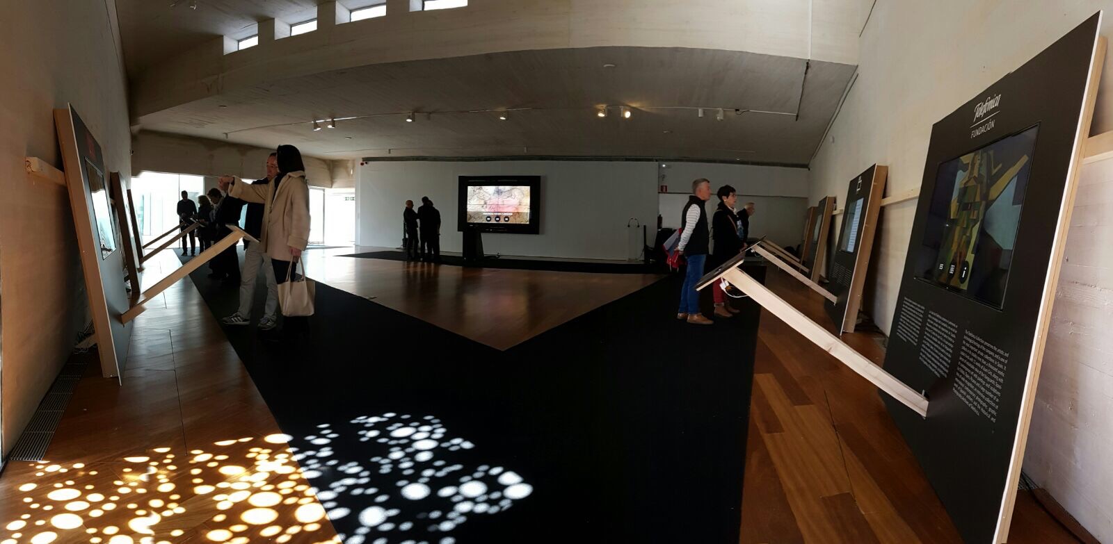
- Each “place” would show only one work and would include a TV screen bracket and iPod stand in a single piece.
The graphic design of the furnishings included:
- A presentation of each participating work in three languages, and simple explanations on the lectern about how to explore the works.
- No component was designed to give information about the project or what types of activities could be carried out. This can be improved upon in future.
- The final exhibition was composed of 7 “standard” posts (55″ screen + lectern with iPod) and one special post (video wall + moveable lectern, enabling it to be used in special sessions).
- A carpet indicated a suggested route for visitors to follow.
Metrics
During the exhibit, random surveys were carried out to obtain direct feedback from visitors. Highlights from the most significant data are as follows:
Visit: 75% of visitors spent over 20 minutes on the visit (according to our observations, in many cases visits were over 30 minutes).
Session: The time spent on exploring each work in 79.8% of cases was between 5 and 10 minutes per work, or more (18.8% between 10 and 20 minutes, and 6.3%, more than 20 minutes).
Satisfaction: The level of satisfaction with the experience was very high. Visitors were asked how interesting they found exploring the works as proposed, and on a scale of 1 to 5, where 1 is not at all and 5 is very, 85.9% rated the experience as a 5, and 12.5% as a 4.
100% of visitors would like the experience to be repeated on a regular basis, and most of them would be willing to pay to enjoy it.
The devices were prepared to capture certain interactions carried out by visitors, to obtain metrics on how the session went (selected language and open details, basically). The app installed on each device was set to return to the home screen (language selection) after a reasonable period with no activity. That data was recorded, so the number of “sessions” could be estimated based on the number of times the app went back to the home screen.
Each user’s language selection was also recorded (the first action visitors had to take to gain access to interactions with the work). The sum of all the language selections for each work also gave us an approximate number of “sessions”. As shown by the metrics collected, the data is very similar, which means the number of sessions recorded is quite reliable (there are small differences due to the fact that there may have been visitors who, for example, started to interact with the work where the previous visitor had left it, without selecting a language and without visiting the home screen).
Conclusions
- Keen public interest (high level of engagement, high level of satisfaction) in the project: an activity that enables them to enjoy art legacies from the past in an appealing digital format with an enriched experience.
- Technical feasibility of the solution (although other formats can be explored in future)
- Economic feasibility, such that building this type of experience, with third party content as well as with proprietary content, is an affordable option for all kinds of institutions, organizations and museums.
- Future aim to explore other interaction formats or improve existing ones, as well as consider other kinds of display formats, like projectors.
- Future aim to explore this solution for other uses: digital replacements, educational programs.
Stay tuned for a new article about another digital exhibition we organized in Marrakech.
If you want more information about Second Canvas Exhibitions, check out our website.
And if this idea of a digital exhibition appeals to you, don’t hesitate to contact us.


